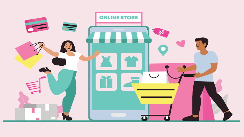
If you consider yourself an average internet user, chances are you have experienced shopping online. In fact, online shopping has gotten so huge that it is projected to be a $740 billion industry by 2023. Especially with the ever-progressive track of technology, online shopping seems to be replacing the good-old physical store visit and shopping sprees.
Witnessing this growth, almost everyone has had ideas to ride the massive tide of electronic commerce, or e-commerce for short. Starting a business online can be challenging, so we are here to lend you a hand. Here, we have listed the best e-commerce websites (in our expert opinion) and lists down why they made it to the AllThingsWWW list.
The internet is home to almost 2 billion websites, so we have set a few criteria for us to filter the best of the best. Here are our metrics for consideration.
Visual design
A website’s visual design plays an important role in retaining a visitor, or when successful, a customer’s attention. As with physically shopping, customers would want to step into a clean and well-organized store. Being an online store requires meticulous attention to what people see, as it will definitely take a toll on your website’s abandonment rate—that is, the number of people clicking out without completing any transaction.
Call to Action
Sometimes, the one thing that keeps a customer from purchasing an item is a small nudge. Calls to action are these light pushes for people to bring out their cards and type in their delivery address. Mundane calls to action may only leave products on the cart and never checked out. A great call to action adds value to the item and the customer, more than just saying ‘Buy Now’ cliches.
Navigation
Nobody wants to get lost in a labyrinth of confusing webpages, which is why a clear sense of direction is needed for a website to increase its sales. Whether it be PayPal integrations, easy product customization, or live chat assistance, these may add up to a smooth visitor experience and earns tips, or in this case, more valuable social media shares.
1. Hu Kitchen
Hu Kitchen is a chocolate-selling website based in New York and sports an impressive website. This website is a complete go-to for paleo and chocolate enthusiasts, from customizable bundles to recipes and blog articles.
Visual Design: 9/10
CTA: 8/10
Navigation: 7.5/10
2. MAC
One of the biggest brands in the cosmetics industry, MAC deserves an early spot on our list. Their use of bold colors gives a sense of empowerment to their shoppers. One of the best features of this website is the ‘Virtual Try-on’ wherein you activate your webcam or front camera, and you will see how a product and its particular shade will look on you.
Visual Design: 7.5/10
CTA: 8/10
Navigation: 9/10
3. Casetify
Casetify is a website that sells artisan and customizable phone cases. The website earned its place on our list because of its sleek design, easy product customization, and a powerful call to action. A downward scroll from the top of the homepage will show you the non-profit organizations Casetify donates to for every product sale. Who would want to miss a chance to be part of something great?
Visual Design: 7.5/10
CTA: 9/10
Navigation: 8/10
4. Fuel Meals
Some people lack the skills to cook good healthy meals; this is where Fuel Meals comes in. Fuel Meals is a subscription-based service that makes customized healthy meals and delivers them right on your doorway. This website has a very clear “How It Works” section that gives a brief explanation of the whole process. Its use of the colors red and white can stir a craving and at the same time muster up the courage to become healthier.
Visual Design: 8.5/10
CTA: 7.5/10
Navigation: 8.5/10
5. AG Hair
AG Hair is a Canadian Hair products manufacturer with a website that gives you a breath of fresh air. Their usage of complementing colors solidifies the fact that they use only the best organic ingredients. What won a spot on this list is their ‘Hair Quiz’: a quick self-evaluation of a customer’s hair. After the quiz, AG Hair will recommend the best product and bundles for your ease.
Visual Design: 8.5/10
CTA: 7.5/10
Navigation: 9/10
6. Lit Pizza
Apart from their awesome domain name, Lit Pizza sports an intuitive, creative, and enticing website. The color palette is consistent and cohesive, and all tabs fall into one long page. Lit Pizza is a Louisiana-based pizzeria with multiple locations. The feature we liked most about their website is the ‘Nutrition Calculator’, in which customers can still make sure they get just enough to remain healthy and just enough to enjoy their pizza.
Visual Design: 8/10
CTA: 8/10
Navigation: 9/10
7. Owala
Among all the websites we have checked in this category, Owala has the most conversational approach. Their no-nonsense style in describing their products won us over. It’s like talking to a real, tangible person and not just reading SEO-targeted product descriptions, although, Owala hits both! The visuals are simple but strong, and all the information you need is packaged well enough, you don’t have to read them twice.
Visual Design: 8/10
CTA: 9.5/10
Navigation: 8/10
8. Care/Of
Care/Of is a multivitamin company located in Vermont, New York. Their well-designed website welcomes visitors with a Quiz button for personalized supplementation. The testimonials are clear, and the collage-style layout works perfectly with the other elements of the website.
Visual Design: 9/10
CTA: 8/10
Navigation: 8/10
9. Palladium
This boots manufacturer from France earned a spot on our list because of its many integrations, including the accessibility option wherein you can adjust the fonts, the colors, and the overall readability of the website. Apart from that, upon reading the “Our Story” panel, the visitor will see a glimpse of the rich history behind the brand, and ultimately adding value to the product itself.
Visual Design: 8/10
CTA: 9/10
Navigation: 8/10
10. The Bouqs Company
The Bouqs Company is a flower shop that partnered with other local florists to provide quality products all over the US. Their website is a one-stop-shop for all your flower-related needs, such as aftercare, detailed arrangement techniques, even an entertaining blog section. The website’s visuals are pretty simple to not overpower the beauty of the flowers, which, in this case, is genius.
Visual Design: 8/10
CTA: 7.5/10
Navigation: 8/10
11. Buffalo Jackson
Buffalo Jackson Trading Company, an apparel company that made its way to our list because of its simple and fresh-looking website. Their products are divided into organized sections, and each item sports great modeling and photography. A scroll down, you get to see the story of how the company was founded, and it may give you another reason to check out the items you liked.
Visual Design: 8.5/10
CTA: 8/10
Navigation: 8/10
12. Art Finder
Artfinder is an art marketplace with artworks from all sorts of mediums, from a long list of artists, and paintings for all budget ranges. What we like most about this website is that apart from being intuitive, it is the feature for a visitor to view the artworks with a particular color. Also, there is an Art News section for current events related to the industry.
Visual Design: 8/10
CTA: 7.5/10
Navigation: 8/10
13. Citizen
Citizen is one of the biggest brands in the timepiece industry. Their website is as luxurious as their best-selling products. The feature that won the website a spot on our list is its Watch Finder tab. Upon answering five questions, the website will generate the watch to best fit the customer’s lifestyle. Not to mention, the watch loading animation really gives a fun twist to the website.
Visual Design: 8/10
CTA: 8/10
Navigation: 8.5/10
14. Go Pro
Go Pro is among the biggest names in the action videography industry. As established as their brand is their website, which pushes the limits of the visitor experience. They only have a handful of products at any given time, so each product has its own demonstration videos. Also, a visitor can easily compare the products side-by-side with their ‘Compare Cameras’ feature.
Visual Design: 8/10
CTA: 8.5/10
Navigation: 8.5/10
15. Carine Roitfield
Carine Roitfeld, a perfumer in Europe, sports a visually enticing website. Perfume shopping is something rarely done online, but this website has a way to invigorate the olfactory sense through its design and product descriptions. The videos on the website also help in setting the mood for their high-class products.
Visual Design: 8/10
CTA: 9/10
Navigation: 8/10
16. 360 Mirror
This product demonstration website is abundant in smooth animations and sleek design. Within one scroll, it creates the need for a visitor to get the product delivered to their own doorstep. All information you may need is found on the website if the mechanism demonstration is not enough for visitors to add to the cart.
Visual Design: 8.5/10
CTA: 8/10
Navigation: 8.5/10
17. Cowboy
This e-commerce website does not beat around the bush. The high-definition photos and 3D rendered models show the visitors what they are in for. Apart from that, the website’s good use of bold fonts and color changing-background adds well to a smooth visitor experience. And that’s not all; a live-chat assistant is always available upon clicking the lower right corner button.
Visual Design: 8.5/10
CTA: 8/10
Navigation: 8.5/10
18. Not Another Bill
Not Another Bill is an online gift shop with one of the best categorization features. It has a simple block layout for the products; and in our opinion, the best part is their search engine in which you can easily narrow down your options using key words such as the color you prefer and the material you want. Also, the website offers products for people of all ages.
Visual Design: 8/10
CTA: 7.5/10
Navigation: 7.5/10
19. Huru
Upon loading the website, the visitors are welcomed with fluid sliding and geometric applications. Although they only have a few products as of the moment, the website is generous with high-resolution photos and clear product descriptions. Each product also has its own gallery for people to see how they fit on different outfits.
Visual Design: 9/10
CTA: 8/10
Navigation: 8/10
20. This Is Sleep
This Is Sleep is a British company that sells pillows, duvets, comforters, and other sleeping aid. The color palette chosen speaks well of the website’s mission—a good night’s sleep. This website’s best asset is its 6-question survey, which will generate the visitor’s best-personalized package. The website on its own is smooth and simple.
Visual Design: 8.5/10
CTA: 8/10
Navigation: 8.5/10