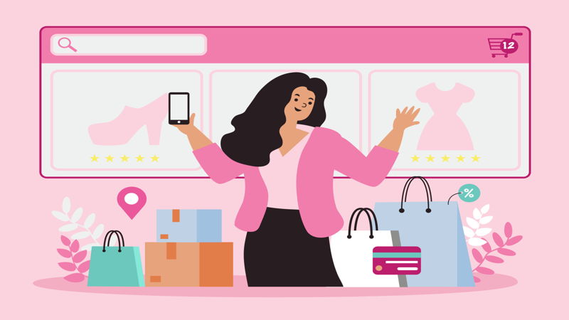
Top 20 eCommerce Websites II
As the world learns to live with the threats of the CoVid-19 pandemic, the eCommerce industry saw an advancement that, under normal circumstances, would have taken 4-6 years. What’s even more remarkable is that experts predict that when the world goes back to normalcy, these eCommerce numbers will remain at a hyper-performing rate.
A few moons ago, we have featured a list of 20 product-based eCommerce websites that were strong in the criteria we set. (Don’t miss out, here’s that list.) Now, as more and more entrepreneurs shift their stores online and the competition is on fire. We knew we had to recognize another set of websites that we admire based on visual design, call to action, and navigation.
Visual design
Visual trends are always dynamic. What’s pleasant looking today may look ancient a few years from now. Also, designs must be coherent with the website’s overall copy tone, the products, and the niche audience. Poor visual design often leads to a website’s high abandonment rate—the number of visitors clicking out without even exploring what a store has to offer.
Call to Action
When we have crossed a bridge halfway, and we don’t know whether or not we’ll go through, all we need is a simple nudge. Calls to action play this role and are especially important for these eCommerce websites. Of course, nobody wants a bombarding call to action, and one would never run out of ways to be creative on this aspect. As mentioned earlier, the eCommerce competition is tough.
Navigation
Don’t you hate it when you get lost on a website? Clear website navigation allows a customer to shop casually with utmost convenience rather than learning how to go through a maze. Remember, any product is usually available on another website. Clear navigation is like lighting the path and paving the way to a closed, successful sale.
So, without further ado, here are 20 websites that hit the AllThingsWWW mark!
1. Stacy Adams
Stacy Adams is a men’s clothing brand based in Massachusetts. Their website sports great calls to action, and the design oozes with suave. Their products are presented in a way all men want: organized and clean. You can search for products by size or even consult an expert through their live chat feature. Upon clicking a product, reviews are shown so customers can see what other people think.
Visual Design: 8/10
CTA: 8/10
Navigation: 8.5/10
2. Free People
Free People is a women’s clothing line brand with a wowing website. Since they only sell women’s clothing, the color palette is Traditionally pink. The fonts they used to complement the overall visual appeal of the website: vintage, classy, and simple. Their products are beautifully photographed, and the website is easily explorable through their categorized tabs. The tone of the website copy feels so intimate; we may just have ordered ourselves some dresses. They also have a sizing guide for all of their products, which is convenient for online shoppers.
Visual Design: 8.5/10
CTA: 8/10
Navigation: 9/10
3. Patagonia
If you are an outdoorsy person (like most of us here at AllThingsWWW), you have most likely heard of or even own gear from Patagonia. Without bias, Patagonia’s website earned a spot on our list because of its magnificent website. Stunning photography will welcome you on their home page, along with a blog about Patagonia’s mission to go zero-waste. Patagonia transcends from being known into being loved through its mission marketing. Also, searching for products is made easier through their search filter, which you can categorize by color, size, and even material used.
Visual Design: 9/10
CTA: 9/10
Navigation:8.5/10
4. Pura Vida Bracelets
Upon visiting the website, Pura Vida (Pure Life in Costa Rican) kisses you welcome with a spin wheel that gives you a chance to get a 10% discount or a free bracelet. What a fun call to action! Pura Vida has a vibrant website that promotes a laid-back feeling. Check out any product, and you’ll see how they would look on your body through creatively stylized Instagram posts from their customers.
Visual Design: 8/10
CTA: 9/10
Navigation: 8/10
5. Hard Graft
If we described Hard Graft’s website in a single word, it would be punchy. The colors gray and brown dominate the website, and the products are shown in crisp, high-definition photos. If you click on a product you like, you are even offered up to 15 pictures so you can see it from all angles. All the pages on the website keep true to their home page: classy, clean, and legible.
Visual Design: 9/10
CTA: 7.5/10
Navigation: 8.5/10
6. Modern Urban Jungle
Modern Urban Jungle sports is a very calming website. It’s completely evident that they target plant-aficionados. Still, even random visitors may just add to their carts because of their soothing web design. What we love most about this website is the stunning photography and the abundance of reviews.
Visual Design: 8.5/10
CTA: 8/10
Navigation: 8.5/10
7. Woodlot
Woodlot is a home and body product brand based in Canada. Their website is a breath of fresh air and whispers organic right off the bat. Whether you’re buying for yourself or for someone else, navigation is made easy and convenient with only three main tabs on the website. Promoting an all-natural lifestyle, their Journal tab is a very valuable asset.
Visual Design: 8.5/10
CTA: 8/10
Navigation: 8.5/10
8. Partake
If you consider yourself cookie-conscious, Partake may just be the perfect brand for you. This New York-based cookie company reassures all customers that their products are gluten-free and hypoallergenic. The website uses playful yet enticing colors. The random pieces of cookies all over the website just make you want to bite right out of your monitor. Another thing we love about Partake is its transparency with its ingredients. It adds to the reassurance and strength of their calls to action.
Visual Design: 8.5/10
CTA: 8.5/10
Navigation: 8/10
9. Death Wish Coffee
This coffee company from New York sports a website that flexes its boldness. Bold in flavors, bold in website design, bold in website copy. Their gothic website completely matches their overall message: this is the coffee of the bold. Another thing special about their website is the availability of coffee recipes anyone can try. They also offer bundled products and a subscription program for caffeine kickers.
Visual Design: 8/10
CTA: 9/10
Navigation: 8/10
10. Soul Kandy
We all love the feeling of receiving and opening gifts, but most of us don’t like taking the time to think of a unique and fun gift we could give. Well, Soul Kandy, a gift-giving eCommerce store, takes care of just that. Their website has exciting colors and fun animation as you scroll through. Also, how they work is completely explained right on the home page. They have every kind of gift for every type of occasion, which is clearly organized on the Shop the Boxes tab. As of the moment, they only cater to women recipients, but who knows when they expand their market?
Visual Design: 8/10
CTA: 8.5/10
Navigation: 8.5/10
11. Salty K
As we all know, visuals play a huge role in keeping visitors engaged, and Salty K has killer visuals. This swimsuit eCommerce website heavily used the image-sharing platform Instagram to add value to its products, making it feel more personal and intimate. The photography of their products and models, along with the colors used on the website, will make you want to dip your toes to where the ocean meets the sand.
Visual Design: 8.5/10
CTA: 8.5/10
Navigation: 8/10
12. MVMT
This California-based watch and jewelry company sports a stunningly sleek website. Searching for a product would not be a hassle because of their well-organized catalog. Great photography also allows for an in-depth look at the intricate details of all the accessories. The website design on its own captures elegance through minimalism.
Visual Design: 8.5/10
CTA: 8/10
Navigation: 8/10
13. Writepads
This paper company from Baltimore offers a great selection of specialty writing products for all kinds of users. They sport a clean-looking website with colors that resemble the feel of paper. What won us over are their product photography and the accessible Reviews tab on the sidebar. They also offer live-chat assistance and some informative blog posts.
Visual Design: 8.5/10
CTA: 8/10
Navigation: 8/10
14. Ritual
Ritual is a multivitamin company with a statement as bold as their website design: transparency and simplicity. The strong usage of the color yellow really adds to the healthy overall glow of the website. Structured intuitively, when visitors scroll through, all questions may just be answered. Products are also laid out clearly through their gender categorization and bundled promos.
Visual Design: 9/10
CTA: 8/10
Navigation: 8.5/10
15. Neuro
Neuro, a nutritional lozenge company from Los Angeles, has one of the most mesmerizing websites we have ever seen. The color palette used induces focus, and the animations along each page entertain the eyes successfully. Shopping is also very convenient through the integration of product colors and flavors. Lastly, reviews and statements from big companies add credibility to the brand itself.
Visual Design: 9.5/10
CTA: 8/10
Navigation: 8.5/10
16. Curtain and Blind Company
This curtain company from Australia has a very refreshing website that uses blues and oranges that complement the homey feeling of their products. Scrolling anywhere would never be boring because of the minimal animations. Their calls to action are so strong yet not annoying. The fonts used are also very legible, and products are photographed elegantly.
Visual Design: 8.5/10
CTA: 9/10
Navigation: 8.5/10
17. Avrox
Avrox is a research and manufacturing company in the UK. As of the moment, the website offers 2 products, which are both performance drinks. The website mainly uses black and white, and once you click on the product, your eyes will be guided to its description and features. Instructions for consumption are also available and well animated, and we liked the video integration and the carrousel features, too!
Visual Design: 8.5/10
CTA: 8/10
Navigation: 8/10
18. Harry’s
This men’s grooming company sports a clean and modern website for the clean and contemporary man. Products are categorized, photographed, and explained well. Since the target market is mostly men, the website stays true to its one-way-trip kind of shopping. They also offer bundles, and promos are clearly indicated on the website.
Visual Design: 8.5/10
CTA: 8/10
Navigation: 8.5/10
19. Bacca
Bacca is a wooden laptop stand brand that wowed us with their website. It does not get simpler than this, we thought. The colors used complement each other and made their products pop out. Bacca is like a small kiosk in the eCommerce supermall, sporting intuitive products and simple transactions. The hover effects for their products were a great touch, by the way.
Visual Design: 9/10
CTA: 8/10
Navigation: 9/10
20. The Practical Man
The Practical Man’s website looks like it’s rendered straight from a hand-drawn website design draft. . . and it works! The geometry makes the website stand out among its competitors. The colors and typography of the website really speak of practicality. Great calls to action welcome you all over the page, and their products are also conveniently arranged and categorized. Not only that, the blog posts on their website may make you stay longer than you’re planning to.
Visual Design: 8.5/10
CTA: 8.5/10
Navigation: 8/10
Go on, check those products out of your cart. We know you want them.
Do you know of a website that should be here on our list? Shoot us a message now, and maybe we’ll add them to the next installment of the AllThings Top 20 list!
Did you enjoy this read? We have a lot more in store for you! Sign up for our email list and earn exclusive access to some of our best content.