Did you know that our attention span is shorter than that of a goldfish?!
We kid, of course. That statement shook the internet like a massive earthquake, with content marketing at its epicenter. It's supposedly based on a research paper published by Microsoft Canada in 2015. While it's true that the report contains an infographic comparing both attention spans, that particular data was pulled from a website called Statistics Brain. After some digging, we weren't able to find the actual paper that cites these numbers.
Did Our Attention Span Dwindle?
Although the study by Microsoft concluded that our attention span saw a decrease (from 12 seconds in 2000 to 8 seconds in 2013), it would not be fair to think of our brains as decaying. Several other researches on the matter of attention span factor in the activities people had beforehand, their demographics, and access to mobile technology.
In fact, the controversial research paper itself says that: "tech adoption and social media usage are training consumers to become better at processing and encoding information through short bursts of high attention."
Our instinct to focus on the important did not go away; it just moved online.
We have learned and adopted to gain information through skimming or cursory reading. This fairly new ability required content marketing to recalibrate from its old ways. We don't like digging through pages and pages of text anymore. When we find what we need, we often leave without hesitation.
We Love Instant and Bite-Sized
Over the past decade, Twitter blew up with a projected user base of over 340 million people in 2024. And the most unique trait of Twitter among other social media platforms is its 280-character limit.
In the past few years, we have seen the letters TL;DR (Too Long; Didn't Read) after long posts and a 1-2 sentence summary of the post.
Not too long ago, 6-second videos were everywhere on the internet. They were called vines.
YouTube has a new feature called Shorts: 60-second videos from channels you follow.
Almost all platforms are evolving to adopt a feature to take advantage of our desire for instant gratification and bite-sized value.
Your website must ride the trend, too!
Designing for Skim Readers
When discussing how users read on the internet, Jacob Nielsen of the Nielsen Norman Group put it perfectly using only two words. "They don't." He then points out that users rarely read the whole page word-by-word but rather scan through the screen and pick out the most insightful words, phrases, and sentences.
Does it mean that the time we used to write our blogs is obsolete? How do we make them stay?
To help you out, here are 7 tips for designing web pages for people who don't read.
- Add a Table of Contents
55% of people leave a website after about the first 15 seconds of their visit on a webpage. And one of the main reasons users click out is they don't know where to look for what they need. A table of contents on the upper area of a page can solve this, especially if it's a blog post or a text-heavy page.
Putting a table has the potential to increase your metrics for on-page time and decrease your bounce rate. If visitors know that you offer what they need, that's a strong reason for them to stay.
- Add a Progress Bar
Progress Bars or Reading Position Indicators (RPIs) are tools that help assure readers that the page they are on does not run infinitely. This will let the reader have an estimate of how fast they will be able to scan or skim through the page. Since a typical web user is always in a rush for value, RPIs serve as a signifier that you value the time they spend on your website, albeit short.
- Choose Good Fonts
Often, visitors do not read simply because they can't. Any website has the potential to increase its on-page time if its content is legible. After all, much of the most valuable information you want to give your visitors is on the content. A clear, legible font can make the difference between night and day. Here are a few simple guidelines to help you choose a great font.
- Avoid over-decorative typefaces.
This applies especially to your content. Also, over-decorative fonts perform poorly when zoomed in or out.
- Use sans serif fonts for the content.
If your website would have a blog section and would be text-heavy, go for the fonts without serif (or tails).
- Adjust the kerning.
The kerning is the space between letters. Too tight, and your words will be barely legible. Too wide, they will look like scattered letters on the screen.
- Use a font that's legible in italics, boldface, or strikethrough.
These stylings are important when emphasizing points, so a font's flexibility will be a priority.
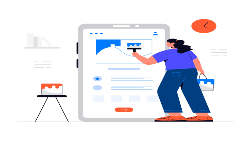
- Use Visuals
When reading long articles, pictures serve as a pause or a visual relief for the strained eyes. These photos can also serve as separators of ideas, a summary of paragraphs, or sales nudges. The use of thematic illustrations is even better than stock photos, so when you can use illustrations, go for it.
- Use the Head Bar Wisely
Our eyes naturally gravitate to the first horizontal line at the top of the page. This is a very important panel on a webpage. If users cannot find the information they are looking for, especially the "About Us" or "Contact Us" pages, they'll bounce out. A study by the Nielsen Norman Group concluded that there are two patterns skim readers scan through a website. They are the F and Z patterns. No matter what pattern we fall into, we still check the heading bar first. So, if your head bar lacks important information about your website, business, or company—they will most likely click out.
- Increase Your Credibility
Websites must first establish trust and credibility to maintain visitors and ultimately convert them into paying customers. One factor that affects a website's readability is its credibility. After all, no one would like to read an article with no basis.
Despite the changing trends in web design, our standards for a website's credibility remained fairly the same throughout the years. When reading objective and non-opinionated blogs (such as this one), hyperlinks to studies assure that they're not reading some hocus-pocus. Of course, it goes hand in hand with the other factors we have discussed, like the visual design.
- Use Infographics
We, humans, are very visual beings. We grab whatever chance we get to visualize data rather than to read it. Well, of course, it's more fun to look at pictures or watch videos than to read plain text.
Infographics soldiered through the internet intending to be read, and it was mighty effective. Did you know that we remember 80% of what we see and only 20% of what we read? It's probably because it's attractive and serves its purpose of giving value instantly.
Did you make it to the bottom? Awesome! If you liked this one, we've got more on the pipeline. Be notified when we publish them! Sign up below!